DiMe (Digital Medicine Society)
Digital medicine database for quick insights
Project type
Website redesign project for DiMe
My role
UX Researcher
UI Designer
Contribution
User Research
Stakeholder interview
Project management
Low-fi/Hi-fi Prototypes
Duration
4 weeks for research and initial design
2 weeks for testing
Tools
Figma
Adobe
Microsoft

OVERVIEW
Background
DiMe is a global non-profit serving the digital medicine community. They advise healthcare, pharma, research, and tech organizations on implementing digital health. The DiMe website provides literary resources, individual education, and organizational education in order for users to be equipped with current information.
Role
I collaborated with stakeholders to identify DiMe's goals, user needs, and pain points. We discussed the key takeaways the website should offer and the challenges users were experiencing. My role involved researching and testing these issues to design a more intuitive platform for medical professionals.
DEFINING THE PROBLEM
Challenges
DiMe's mission is to unite global leaders and innovators to bridge the gap between traditional healthcare and emerging digital solutions. The challenge is to address unique healthcare issues through digital innovation while presenting complex medical and technological information in an accessible and engaging way. The website must cater to a wide audience, from individuals seeking education to organizations looking for implementation strategies, ensuring that users can quickly and effectively find the information they need.
Goals
Primary goal: Increase awareness of DiMe's resources among users
Secondary goal: Encourage users to become more involved with DiMe
How might we improve the Digital Medicine Society’s website so that users on the site are successful when accessing the information and data that they need?
INITIAL USER TESTING
Navigation
Solution: Card sorting
Key Takeaways
During initial user testing, one major issue identified was navigation. Users struggled to locate key features, such as the resource library and mission statement. Once they reaches the resource library, they found it confusing to filter and find publications
To address these navigation challenges, I conducted card sorting exercises, allowing users to organize content in a way that reflected their reading and navigation preferences.
Renamed categories: Improved clarity and relevance for users
Home navigation adjustment: Removed the "Home" option from the navigation bar, designating the top left logo as the home link instead
Footer enhancements: Maintained the existing footer while adding footer navigation and a newsletter sign-up feature
Sitemap

DESIGN PROCESS
Sketch
.png)


Low-Fidelity Prototype
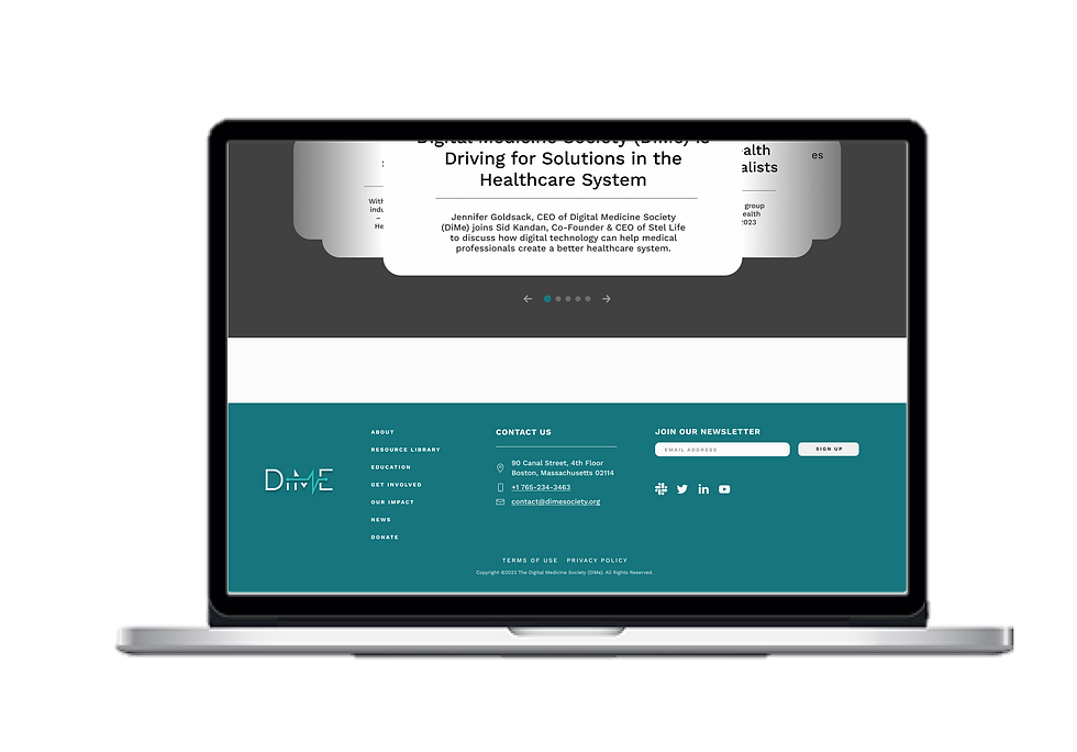
Home Page
.png)
Resource Library

Filter Dropdown
.png)
Adjustments
The testing highlighted navigation challenges and user preferences, providing valuable feedback for refining the design and usability for the hi-fidelity prototype.
-
To start, enhancing navigation clarity will increase the visibility of essential sections, including "Digital health Learning for Individuals and Organizations".
-
Additionally, improving the filter options display will enable quicker access to documents.
-
Lastly, optimizing layout preferences by providing additional layout options on the resource library page will better accommodate user preferences for text- oriented searches and enhance resources accessibility.
Style & branding
I collaborated with developers to understand the current colors and typography, making sure that my design aligns with DiMe's established brand identity.
UI Style Guide

Style Tile

Hi-Fidelity Prototype
After finalizing the style guide, I proceeded with the UI design. Below are some key frames I designed for the home page, resource library, and filters.


Home page
Resource Library


List view
List view: Scroll to bottom


Grid view
Grid view: Scroll to bottom

Toggled filter
Usability Testing Results
The following results highlight the effectiveness of the recent redesign of the DiMe website, focusing on user navigation and resource accessibility. Through usability testing with seven participants, I evaluated their ability to complete key tasks efficiently, providing valuable insights into the improvements made in the prototype.
Usability testing overview:
-
Total Users: 7
Tasks completed:
-
Find the article labeled "Core Measures of Physical Activity"
-
Find the "Online Meetups" and "Register Now" button
-
Locate the Resources Library
Completion rate:
-
Success rate: 100% of users completed all three tasks successfully
A/B testing findings:
-
Average time to find specified article:
-
List view: 12.22 seconds
-
Grid view: 7.77 seconds
-
These results indicate significant improvements in navigation and resource accessibility in the redesigned prototype, particularly in the grid view.
FINAL THOUGHTS
Reflection
I've learned that it's important to ensure that resources on digital healthcare are easily accessible and crucial for empowering all healthcare providers. The design for DiMe must prioritize smooth and clear usability while accommodating a wide range of users across the healthcare industry. This accessibility is vital for creating an inclusive environment where all stakeholders can efficiently navigate and utilize the available resources.
Going forward
For the next iteration of the high-fidelity prototype, I plan to implement several key changes aimed at enhancing usability and accessibility. These include increasing the header font size to improve readability, re-testing the usability of filter buttons to ensure intuitive navigation, and evaluating the effectiveness of color-coded tags for resource categorization.
Additionally, I will collaborate with DiMe developers to establish a new color scheme that aligns with AAA accessibility guidelines. While the current design meets AA standards, this upgrade will further enhance the website's usability for individuals with varying degrees of visual ability, ensuring a more inclusive experience for all users. By prioritizing these changes, I aim to create a more effective and user-friendly platform that meets the needs of the digital medicine community.